All projects
SARNCO Branding
Client
OhioHealth
Category
Branding
DURATION
3 mo
YEAR
2019
The challenge
SARNCO stands for the Sexual Assault Response Network of Central Ohio. Never-before broadly advertised, they needed branding and advertising for the launch of their 2019 awareness campaign.
The goal
Create an empathetic and supportive brand presence, with prominent resource or crisis contact information throughout all materials.
View the live site
PROCESS –
PROCESS –
PROCESS –
PROCESS –
the process
Read more
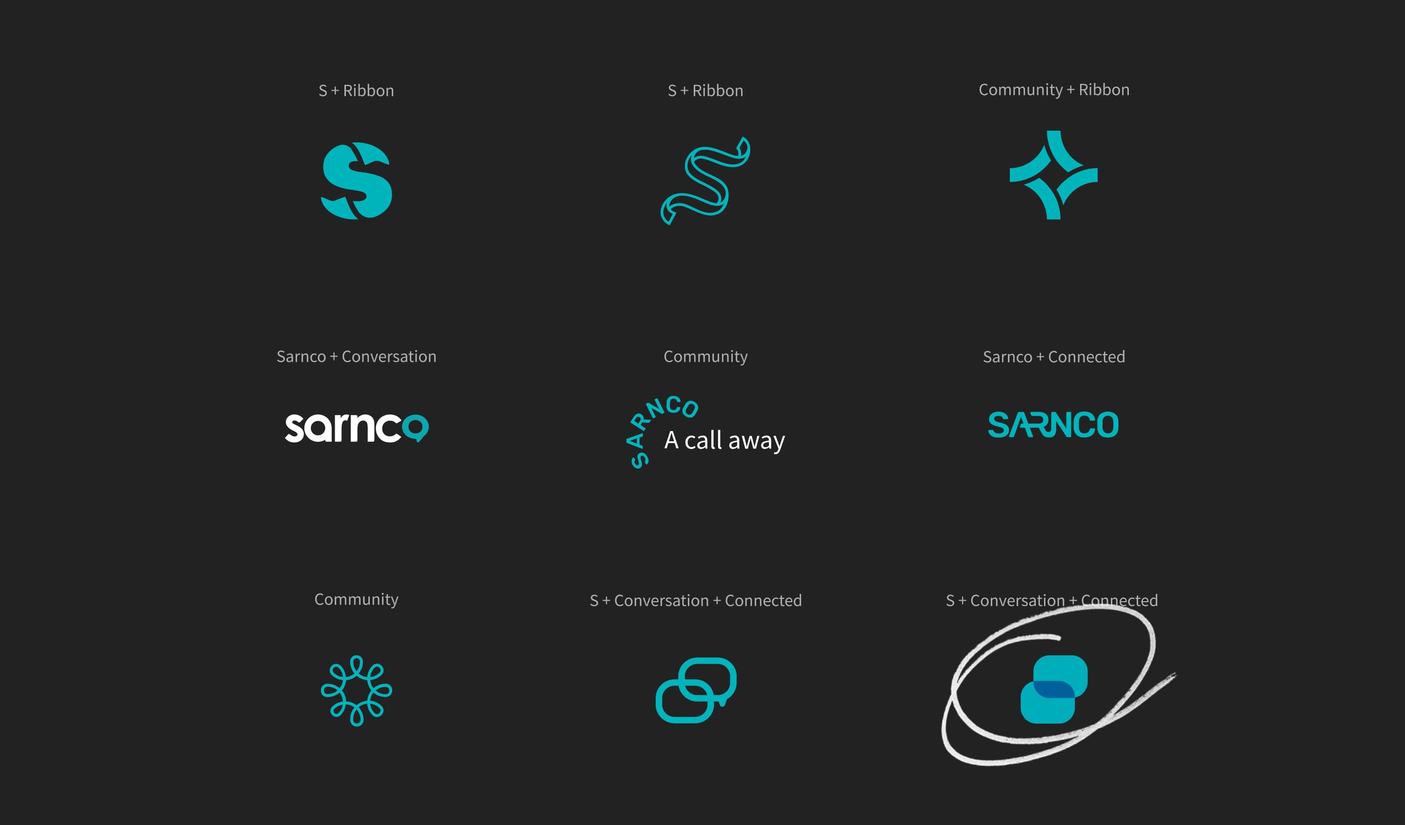
In the healthcare world, specifically through programs in Ohio, the color that is used to represent sexual assault victim support is teal, usually used as a ribbon. When designing the logo the prominent color was teal, and eventually blue was pulled in from the parent brand: OhioHealth. Initial concepts consisted of ribbons, speech bubbles, connected shapes, and more.
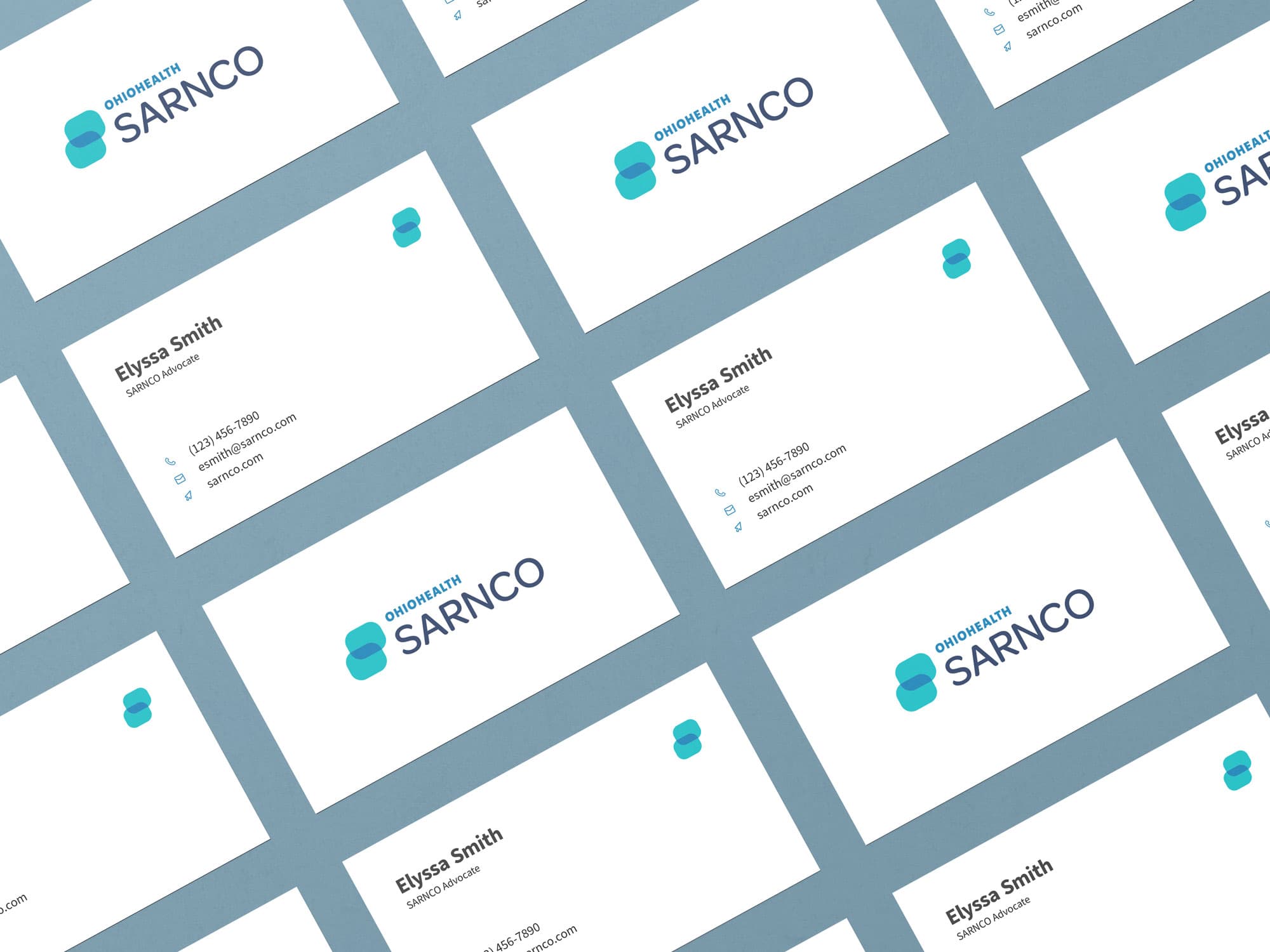
The key was representing community, support, and communication. This eventually led us to the current mark – two abstracted speech bubbles, representing outreach and support, that connect to create the SARNCO 'S'.
No items found.
Conclusion
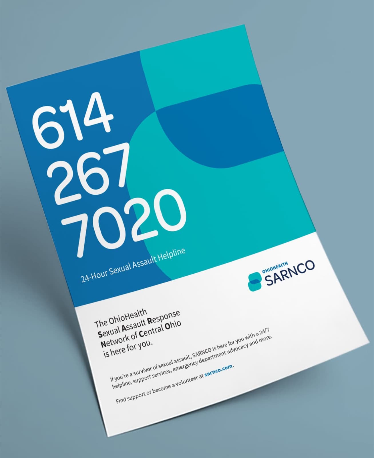
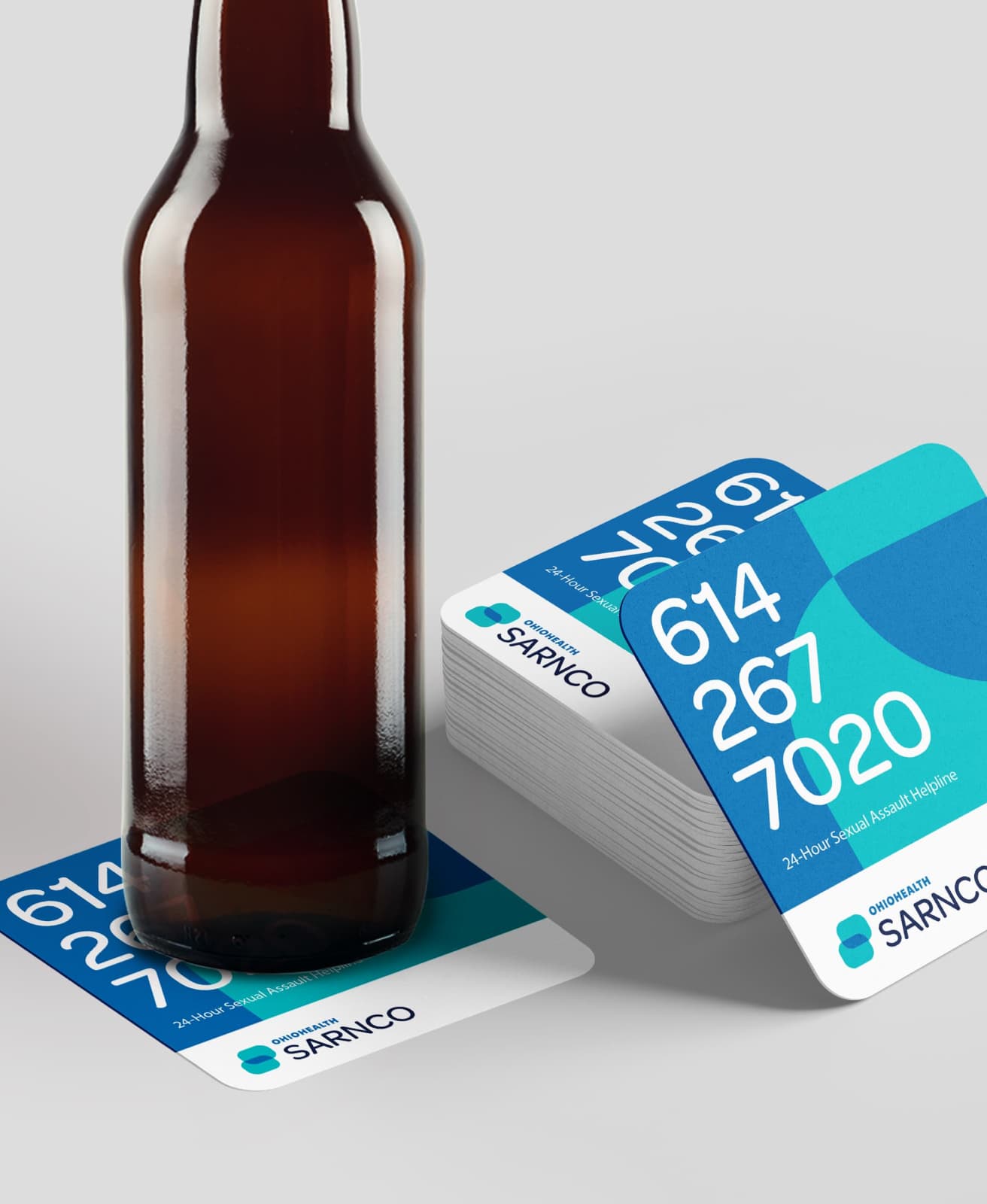
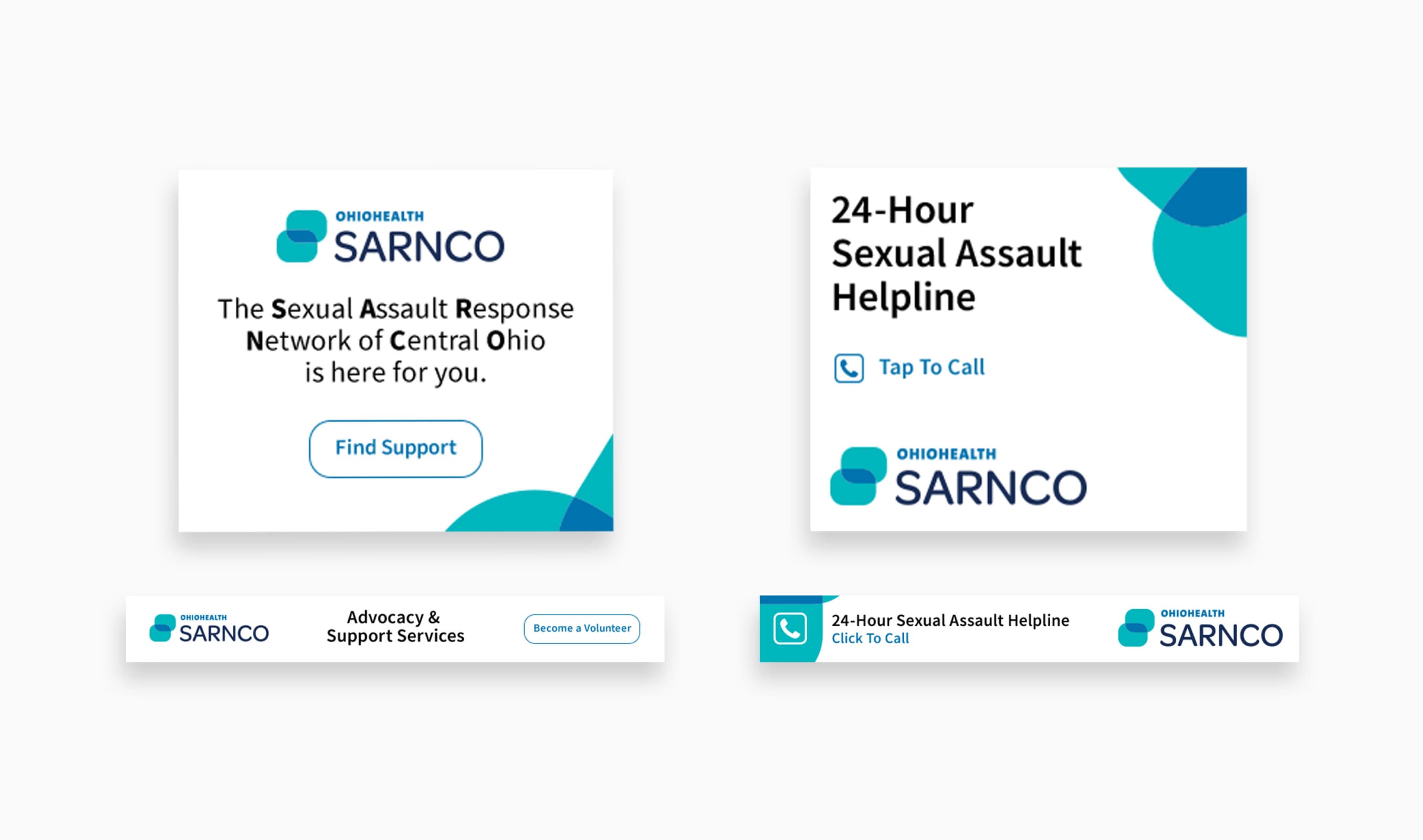
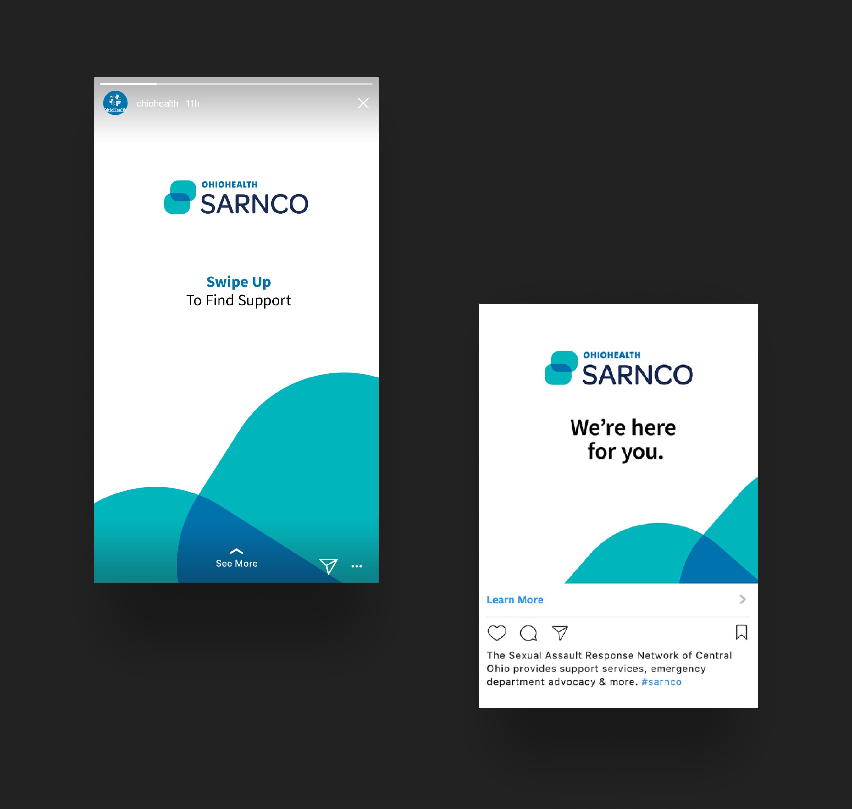
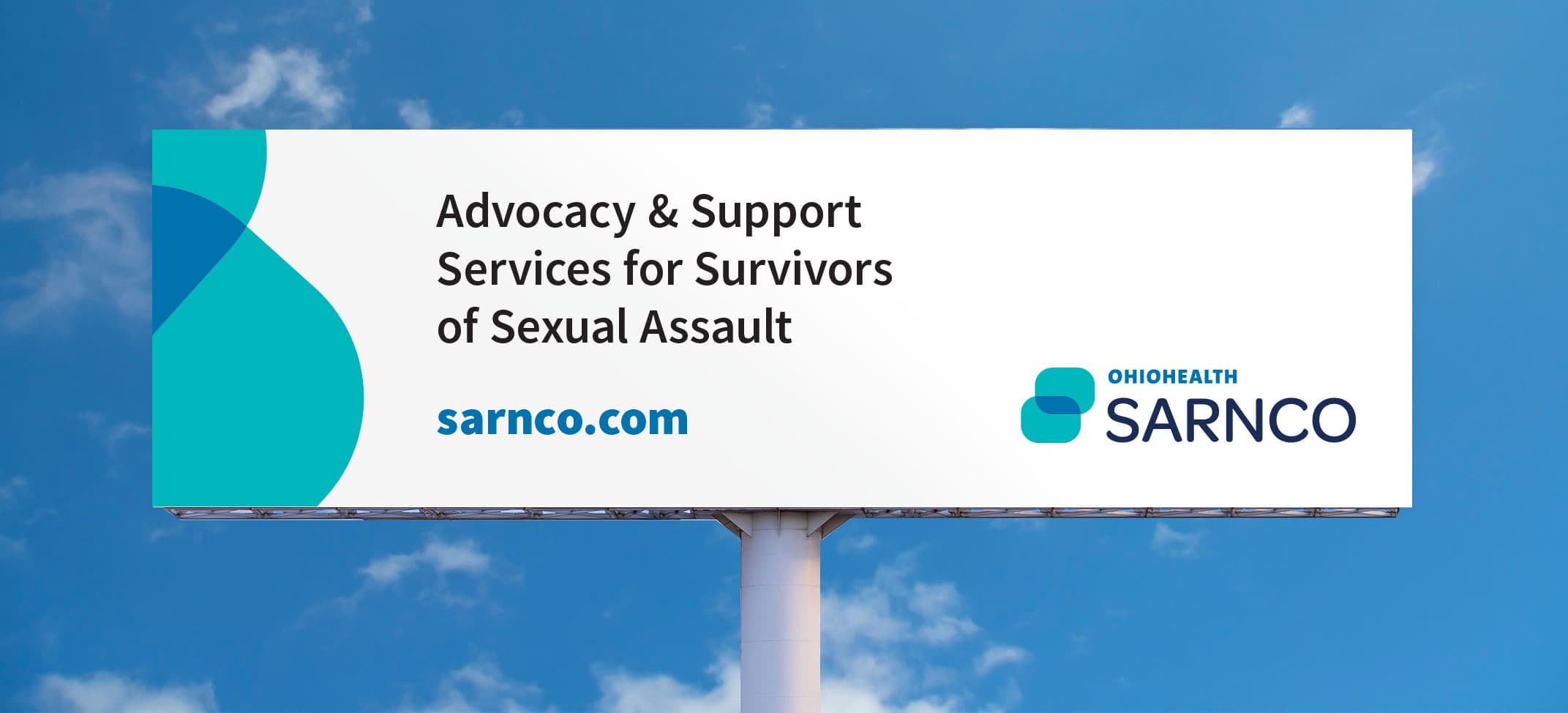
To complete the campaign, we worked with our PR and Media teams to integrate digital ads, outdoor, and location-tied activations such as coasters at local bars and fliers in public restrooms. The main call-to-actions for every single advertisement were to find support resources or to become a volunteer. This paired with minimal, but emotive, design treatments allowed for the message to reach our target audience loud and clear.
Read the full case study
View the live site
ROLES
ART DIRECTION
BRAND STRATEGY